For our most recent analysis of the electoral landscape, please see: “The Path to 270 in 2020” by Ruy Teixeira and John Halpin
This report contains a correction.
Introduction and summary
The unprecedented and largely unanticipated election of Republican candidate Donald Trump as president of the United States in 2016 set off intense debates about how his victory was achieved and which factors mattered most in determining the outcome. Although Democratic candidate Hillary Clinton won a plurality of the national popular vote—48.2 percent—with a nearly 3-million vote margin, Donald Trump carried 30 states and won the Electoral College vote by a 304-to-227 margin.1
What happened to produce these results?
In the immediate aftermath of the election, and over the ensuing months, electoral analysts have tried to assess two main components of how the 2016 election unfolded: the breakdown of the vote itself and the motivations for these vote choices.
In the first category are items including vote composition, or the percentage of various demographic groups as a share of all voters; turnout rates, or the percentage of eligible voters in various demographic groups that actually voted; support rates, or support for the Democratic or Republican presidential candidate by demographic group; and shifts, or increases or decreases in vote composition, turnout, and support rates compared to past elections for various demographic groups. The second category focuses primarily on public opinion data and other qualitative research methodologies to see how views of the candidates, campaign dynamics, and specific attitudes and policy beliefs among voters shaped the overall vote choice.
For the purposes of this paper we are examining the former category, with a particular focus on vote composition, turnout, and party support rates by demographic group, to get a more precise read on what actually happened in the vote itself in 2016. For a thorough analysis of what determined the vote, the recently established Democracy Fund Voter Study Group produced an excellent series of papers, including one by two of the authors of this report, examining the Trump and Clinton coalitions and the issues and social beliefs that shaped people’s voting decisions in 2016.2
The most vexing issue for electoral analysts exploring these voting trends is determining which, if any, of the existing data sources provide the best and most reliable information on vote composition, turnout, and support rates. For this project, we developed original turnout and support estimates by combining a multitude of publicly available data sources including the American Communities Survey (ACS), the November supplement of the Current Population Survey (CPS), the American National Election Study (ANES), the Cooperative Congressional Election Survey (CCES), our own post-election polling, and voter files from several states.
We used this approach to help address what we believe are systematic problems with some of the most widely available and most frequently cited pieces of data about elections—mainly, that some of the most reliable sources of data we have on demographics do not fit well together with the best data we have on turnout rates, leading to results that vary from the actual levels of turnout seen on Election Day. Furthermore, if we combine those data with the best data we have on vote choice, we get election results that do not line up with reality. This is not due to any one source of information being particularly biased; rather, each particular source has points of weakness. To overcome this, we created a new method for combining these data in ways that fit with known outcomes. (see the Appendix for full description of our methodology)
As will be seen, our results on vote composition, turnout, and support rates are frequently quite different than the most commonly cited data on elections: the national exit poll conducted by the major media outlets on Election Day. We believe our methodology gives us a fuller and more complete understanding of voter trends. But as with any study combining data sources, our results are dependent upon the quality of the publicly available surveys themselves. The sources we’ve employed in this project are considered to be the top U.S. election surveys in existence, and we feel confident that our results are as close to reality as can be gathered from survey and modeling research.
For our analysis, we broke the U.S. population down into 32 demographic groups made up of four racial categories—white, black, Latino, and Asian and other race; four age groups—18–29, 30–44, 45–64, and 65+; and two education groups— people with a four-year college degree and people without a four-year college degree. The product of this analysis is the following for each of those 32 groups:
- County-level estimates of eligible voter composition
- County-level turnout estimates
- County-level estimates of voter composition
- County-level party support estimates
These estimates are fully integrated with one another and, when combined, recreate the elections results observed in 2012 and 2016.
Despite scores of worthy and incisive studies of the election, we still do not have a clear understanding of some of its basic dynamics.3 With these unique data in hand, broken down by group nationally and in all 50 states, the goal of this report is to answer the following questions to the best of our ability and to make some assessments of alternative scenarios to help inform these debates and to offer insights into emerging strategies of both Democrats and Republicans, going forward.
- How much did differential turnout rates between white voters, including those who are college educated and those who are not college educated, and voters of color, including those who are black, Latino, and Asian American or other race affect the outcome of the election?
- What exactly happened with the white vote, especially the white college-educated and white non-college-educated vote? How large is this latter group of voters compared to others? Was there a big surge in support among white non-college-educated voters for Donald Trump, or not? How well did Hillary Clinton do with white college-educated voters compared to President Barack Obama?
- What exactly happened with the racial minority vote? Did Republicans do better or worse with black, Latino, and Asian American or other race voters?
- How did these turnout and support dynamics by group influence the outcomes in key Electoral College states such as Florida, Michigan, North Carolina, Ohio, Pennsylvania, and Wisconsin?
- If black turnout and support rates in 2016 had been equal to black turnout and support rates in 2012, what would the results have looked like in 2016? What about Latino margins?
- If white non-college-educated support for Democrats had been equal to white non-college-educated support for President Obama in 2012, what would the results have looked like in 2016?
- What do these results and simulations tell us about party strategies for the 2020 election and beyond? Can President Trump and Republicans rely on their 2016 strategy and expect similar results?
Who really voted in 2016?
The national story
Exit polls indicated that the voting electorate in 2016 was 71 percent white, 12 percent black, 11 percent Latino, and 7 percent Asian or other race. Compared to 2012, the share of white voters dropped by a percentage point, as did the share of black voters.4 The vote share of Latinos increased by a point and the vote share of Asians and all other racial minorities increased by 2 points.
Our estimates tell a significantly different story about the racial/ethnic distribution of voters. The most salient difference here is that the exit polls underestimated the share of white voters and overestimated the share of voters of color. Our estimate is that 73.7 percent of voters were white (compared to 71 percent in the exits), 8.9 percent were Latino (compared to 11 percent), and 5.5 percent were Asian or other race (compared to 7 percent). However, our figures agree with the exit polls on the percent of black voters (12 percent).
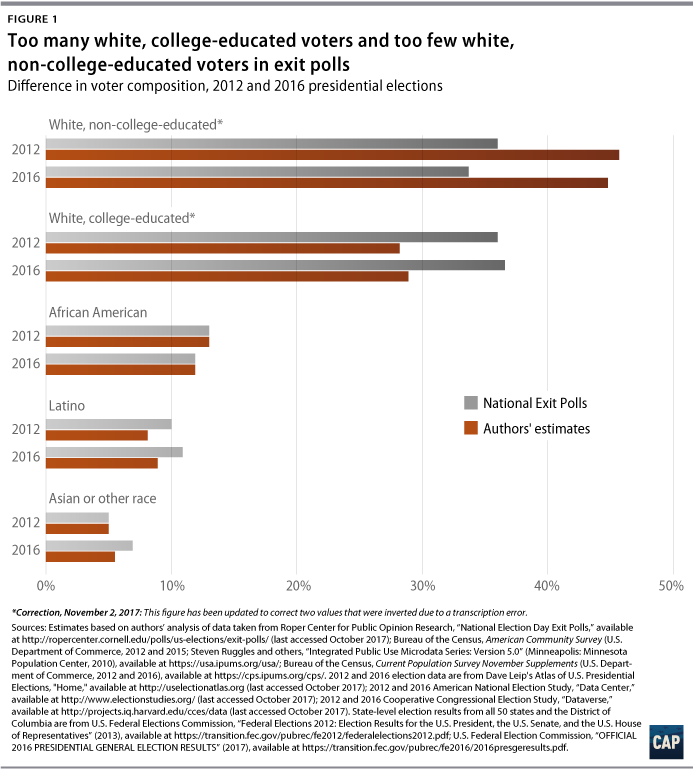
As for shifts from 2012, our data show that the white vote share declined by only 0.3 percentage points in 2016. We found that the black vote share declined by 1.1 points, which mirrors the exit poll results, while the Latino vote share increased by 0.9 points and the vote share of Asians or other races increased by 0.5 points. So, other than shifts in the black vote share, we generally found less change in the racial/ethnic structure of the voting electorate between the two elections.
The biggest and arguably most important difference between the exit polls and our data on vote composition lies in the division of white voters between those who are college-educated, with a 4-year college degree, and those who are not college-educated, with only some college education or less. Briefly put, the exit polls radically overestimated the share of white college-educated voters and radically underestimated the share of white non-college-educated voters.5 The exit polls claimed that white college graduates actually outnumbered non-college-educated white voters at the polls in 2016, 37 to 34 percent. Our data indicate a vastly different story: white college graduates were only about 29 percent of voters, while their non-college-educated counterparts far outdistanced them at 45 percent of voters.
In addition, we estimate that the white non-college-educated share of voters decreased by only a percentage point in 2016, compared to the 2-point decline shown in the exit polls. However, our estimate of a 0.7-point increase in the share of white college-educated voters is quite close to the exit poll estimate.
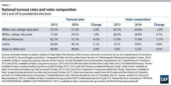
Our data also included estimates for the turnout of eligible voters in both 2012 and 2016 so that we could assess the role of turnout in shifting vote shares in the electorate. Our data indicate that white turnout went up 3 points, from around 61 percent in 2012 to 64 percent in 2016. This is part of the reason for why the white vote share dropped by only 0.3 points even though the white share of eligible voters dropped by 1.7 points.
The other part of the reason for why the white vote share held up so well is that the black vote share did not. As noted above, the black vote share declined by a point even though the black eligible voter share went up 0.2 points. This reflects a substantial drop in black turnout between the two elections, falling more than 4 points from 62.1 percent to 57.7 percent.
However, the turnout of Latinos and Asians or other races both went up modestly, in each case by about 2 points—from 44 percent to 46 percent for Latinos and from 47 percent to 49 percent for Asians or other races.
Among white voters, our data indicate that turnout among both white college-educated and white non-college-educated voters went up. However, turnout increased more among white non-college-educated voters, increasing 3 points from 54 percent to 57 percent, compared to a 2-point increase among white college graduates—from 78 percent to 80 percent.
Finally, our data allowed us to estimate the effects of these turnout trends on vote outcomes in 2016. In a subsequent section, we will examine the effects of shifts in voter support on 2016 outcomes. For example, what if the white non-college-educated turnout had remained the same in 2016 as it was in 2012? Our estimate suggests that Hillary Clinton would have won the popular vote by 0.6 percentage points more than she actually did—that is, instead of a 2.1-point national margin over Donald Trump, she would have won the vote by 2.7 points.
And what if black turnout had remained the same in 2016 as in 2012, instead of going down like it did? Clinton would have won the popular vote by an additional 0.8 points—a 2.9-point national margin over Trump instead of a 2.1-point margin.
The story in the states
But of course Clinton did not win the election, despite winning the popular vote. The real action was in the states, where she lost the battle for an electoral vote majority. In this section, we’ll look at who voted in key states in 2016 and how much difference turnout-related factors made in these states.
We’ll start with the trio of Rust Belt states—Michigan, Pennsylvania, and Wisconsin—that were decisive to Trump’s victory.
In Michigan, our data indicate that 2016 voters were 82 percent white, divided between 54 percent non-college-educated and 28 percent college-educated. This means that the percentage of the vote that was white and non-college-educated was much greater than the exit polls reported—75 percent, 42 percent, and 33 percent, respectively. We also found that the share of white non-college-educated voters dropped by a percentage point compared to 2012, despite the exit polls showing that their share increased by 2 points, while the share of white college graduates increased by 1.6 points, despite the exit polls claiming their share dropped by a not-terribly-credible 5 points.
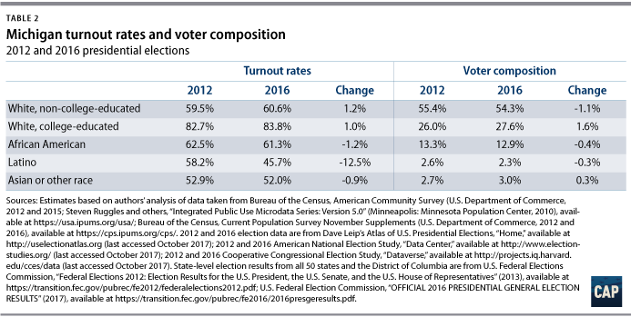
In terms of voters of color, our data indicate that Michigan’s voting electorate in 2016 was 13 percent black, 2 percent Latino, and 3 percent Asian or other race, figures that are all lower than those reported by the exit polls. Compared to 2012, black voters decreased by 0.4 percent and Latino voters by 0.3 percent, while Asians and those of other races increased by a modest 0.3 points.
Turnout for white Michigan voters went up 1.5 points in 2016, with both white college-educated and non-college-educated voters experiencing roughly equal increases in turnout. This increase in white non-college-educated turnout is why the white non-college-educated share of actual voters dropped by only a point although their share of eligible voters dropped by about 2 points.
Latinos, in contrast, showed a very sharp drop in turnout of almost 13 percent. Black voters, meanwhile, saw their turnout go down about a point, as did Asians or other races.6
How much difference did these shifts in voter composition and turnout make? Here we must keep in mind that Michigan is not a hard state to hypothetically flip, because the election was so close there—just a 0.2 percentage point margin, or about 10,000 votes, separated Trump and Clinton.
Our estimates indicate that if black turnout had remained at its 2012 level, Clinton would have carried the state. For that matter, she also would have carried the state if white non-college-educated turnout had remained at its 2012 level, instead of going up. And it would have probably been enough to flip the state if Latino turnout had remained stable across the two elections.
Turning to Pennsylvania, our data indicate that 2016 voters were 84 percent white—54 percent of the total vote was white non-college-educated and 30 percent was white college-educated. Here, again, the white percentage of voters was greater than was shown in the exit polls, at 84 percent versus 81 percent, but this difference is less drastic than in Michigan.
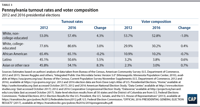
However, the differences with respect to white non-college-educated and college-educated voter turnout are huge: the exit polls showed the share of white college voters to be actually larger, at 41 percent, than white non-college-educated votes, at 40 percent, while our data show that white non-college-educated voters were actually far more numerous.
In terms of voter share, white non-college-educated voters declined by a percentage point compared to 2012, not increasing by 4 points as the exit polls claimed. The share of white college-educated voters went up by a modest 0.4 points.
Pennsylvania’s voters, according to our data, were 10 percent black, 4 percent Latino—2 points less than the exit polls reported—and 3 percent Asian or other race. Compared to 2012, black voters decreased by a little less than a point while Latino and Asian or other race voters each increased by a little less than a point.
Turnout for Pennsylvania’s white voters went up significantly; white college graduate turnout was up 3 points and white non-college-graduate turnout was up more than 4 points—the reason why the white non-college-graduate vote share declined by just a point when their share of eligible voters dropped by 2 points.
Black turnout was down a very modest 0.2 percentage points across the two elections. But the turnout of other racial minorities showed sharp increases: Latino voters were up 6 points and Asians or other races were up 8 points.
Our estimates indicate that changes in black turnout in Pennsylvania had little effect on the election outcome; had black turnout remained at its 2012 level, it would have done little to overcome Clinton’s 0.7-point deficit in the state. However, our estimates show that if white non-college-educated turnout had remained at its 2012 level, instead of increasing significantly as it did, Clinton would have been able to carry the state.
In Wisconsin, we found that 2016 voters were 90 percent white, with 59 percent white non-college-educated and 31 percent white college-educated. This compares to exit polls that reported an 86 percent white vote, split between 47 percent non-college-educated and 39 percent college-educated. Again, our data show that the state’s electorate was much more white and non-college-educated than the exit polls reported.
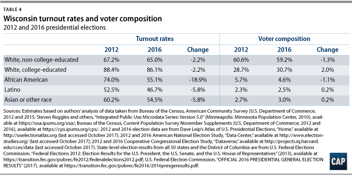
Our data also show that the share of white non-college-educated voters declined by more than a percentage point compared to 2012, and the white college share increased by 2 points. This is pretty much the opposite of the story told by the exit polls.
Wisconsin’s 10 percent nonwhite voters were divided into 5 percent black, 3 percent Latino, and 3 percent Asian or other race. Black voters dropped a little more than a point in vote share while Latino voters increased by 0.2 points, as did Asians or other races.
The declining black vote share can be traced to very sharp decline in black turnout in the state, dropping 19 points from 74 percent in 2012 to 59 percent in 2016. Interestingly, white turnout also dropped, though much more modestly—about 2 points among both white college-educated and non-college-educated populations. Latino voters and Asians or other races had sharper drops of about 6 points each.
In contrast to Pennsylvania, here we found that black turnout had a significant effect on the election outcome; had black turnout remained at its 2012 level, instead of dropping as it did, Clinton would have erased her 0.8 point deficit and won the state, albeit narrowly. None of the other changes in turnout from 2012 to 2016 had much of an effect on the outcome, according to our analysis.
Across these three key rustbelt states, then, black turnout went down everywhere. In Michigan and, especially, Wisconsin, if black turnout had held at its 2012 levels, Clinton would have captured those states’ electoral votes. In Pennsylvania, on the other hand, the decline in black turnout did not appear to matter to the outcome.
In all three states, our data indicate that the percentage of the voting electorate that was white and non-college-educated was much higher than was suggested by the exit polls. We also found—again contrary to the exit polls—that the white non-college-educated share of voters declined by about a point in all three states, despite increases in the turnout of these voters in two of the three states. This reflects the ongoing decline in the white non-college-educated share of eligible voters, which could be only partially mitigated by increases in white non-college-educated turnout. However, it is important to stress that these increases in white non-college-educated turnout were otherwise important: In two of the three states—Michigan and Pennsylvania—Clinton would have been able to carry the states if this group’s turnout had remained at 2012 levels.
We will now turn to three states that Trump flipped from 2012 where the electoral contests were not as close: Florida, Iowa, and Ohio.
In Florida, we found the same pattern of an electorate with a greater percentage of white and non-college-educated voters than was indicated by the exit polls. In terms of shifts from 2012, the most interesting change was that the white non-college-educated share of voters went down so little—a mere 0.3 points—despite that group’s share of eligible voters falling by almost 3 points. This was due to a nearly 7-point increase in white non-college-educated voter turnout. Without that turnout spike, Trump might not have carried the state.
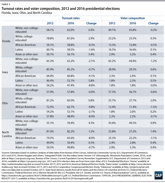
In Iowa, our data show that the heavily white—94 percent—electorate was dominated by white non-college-educated voters, which made up 64 percent of the vote rather than the 50 percent reported by exit polls. The biggest change in the structure of the electorate compared to 2012 was a 1-point decline in the share of white non-college-educated voters. Turnout was down for all racial groups except Latinos, whose turnout increased by 6 points. However, our estimates indicate that turnout shifts had little to do with Clinton’s 9-point deficit in the state: If Iowa turnout patterns had remained the same as they were in 2012, it would have barely moved the needle.
Ohio’s voting electorate in 2016 also showed a greater percentage of white and non-college-educated voters than was indicated by the exit polls: it was 84 percent white—57 percent white non-college-educated and 28 percent white college-educated. White non-college-educated voters were down by a modest 0.6 points from 2012, while white college voters increased their vote share by 2 points and black voters declined by close to the same amount. The latter was tied to a sharp drop in black turnout in the state—down 10 points from 73 percent to 63 percent. This by itself dropped Clinton’s margin in the state by almost 2 points. But because she lost Ohio by more than 8 points, this was hardly the decisive factor in her loss.
Another key loss for Clinton was North Carolina, although this was a state that Obama also did not carry in 2012. Here the white share of voters actually went up—increasing by 2 points to 72 percent—and, very unusually, this included a 1-point increase in the share of white non-college-educated voters. Black voters, on the other hand, declined by 3 points as a share of voters, reflecting their 9-point fall in turnout, from 75 percent in 2012 to 66 percent in 2016. By itself, this decline in black turnout did not hand the state to Trump because, even if 2012 levels had been maintained, Clinton would still have lost narrowly. But the race in that state would have been a great deal closer.
Finally, we’ll look at three important states where Clinton actually improved Democratic performance relative to 2012: Arizona, Georgia, and Texas.
In Arizona, our data indicate that 73 percent of the electorate was white—45 percent white non-college-educated and 29 percent white college-educated—quite a bit different from the exit polls, which claimed white college-educated voters outnumbered white non-college-educated voters by 40 to 35 percent. We also found that white non-college-educated voters declined as a share of voters by almost 2 points from 2012, despite a fairly solid increase in turnout. Latinos increased their share of voters by 2 points, reflecting both higher turnout—up 5 points—and a rapid increase in their share of eligible voters, now more than 22 percent. Our estimates show that turnout-related factors played only a minor role in Clinton’s substantially improved margin in the state relative to 2012—a 3.5-point deficit in 2016 versus 9 points in 2012. Increased Latino turnout was responsible for only about a single percentage point of that improvement.
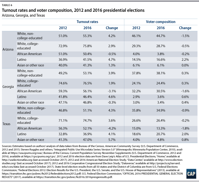
In Georgia, we found that the electorate was 63 percent white—38 percent white non-college-educated and 24 percent white college-educated—compared to exit polls that found the white non-college-educated and college-educated electorate split evenly, with 30 percent each. The black share of voters declined by almost 2 points from 2012, while white non-college-educated voters—despite decreasing their share of eligible voters by 2 points—showed a modest increase of 0.3 points. These trends were tied to a decrease in black turnout—down 3 points—and an increase in white non-college-educated turnout—up 4 points—in 2016. Neither of these trends explain why Clinton did better than Obama in Georgia in 2016, with a 5-point deficit compared an 8-point deficit in 2012.
Texas voters in 2016 were 61 percent white in 2016—split between 35 percent non-college-educated and 26 percent college-educated—13 percent black, 21 percent Latino, and 5 percent Asian or other race. These figures, relative to 2012, represented a decline of a percentage point in the share of white non-college-educated voters, a decline in black voter share of 2 points, and an increase of 2 points in Latino voter share. Related to these shifts, black turnout declined by 4 points, while Latino and white non-college-educated turnout increased by the same amount. The increase in Latino turnout did play a role in Clinton’s improved performance in Texas compared to 2012, but it only explains about a point of her improvement in the state, which was a 7-point shift, cutting the Democratic deficit from 16 to 9 points.
Who actually voted for Trump and Clinton?
In this section we’ll look at the other big shifts that were important in 2016: changes in support levels among different groups for the Democratic and Republican candidates compared to 2012. Where, nationally and in key states, did Trump do better—or worse—than Romney, and where did Clinton do worse—or better—than Obama? And how important were these shifts to the election’s outcome? We believe we have the definitive answers to these questions. As will be seen, the shifts in support that took place were large, important, and typically of greater import than those generated by changes in turnout patterns.
The national story
We found, as the exit polls did, that there was a substantial margin shift toward Trump among white voters with no college degree. However, our data indicate that this shift was smaller: about 6 points, from a Republican advantage of 25 points in 2012 to a 31-point advantage in 2016. The exit polls showed a shift from a 26-point GOP advantage to a 37-point advantage.
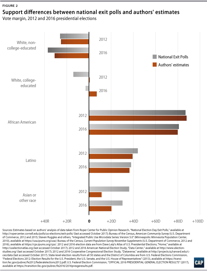
We also found a smaller shift among white college graduates toward Clinton: 11 points according to the exit polls versus 6 points according to our data. And there is another very interesting difference between our data and the exit polls. The exit polls claimed that the Democrats lost white college graduates in both 2012 and 2016—42-56 percent in 2012 and 45-48 percent in 2016. We do not believe this is true. Our data indicate that both Obama and Clinton carried white college graduates in their respective elections—Obama by 49.4-48.7 percent and Clinton by 50-43 percent.7
Our findings on black and Latino voter support are more similar to the exit polls. Black support for the Democrats declined from 94-6 percent for Obama to 88-8 percent for Clinton—a margin shift of 8 points, compared to the 6 points reported by the exit polls. Latino support fell from 69-30 percent to 65-29 percent, slightly less than the exit polls’ reported 6-point margin decrease.
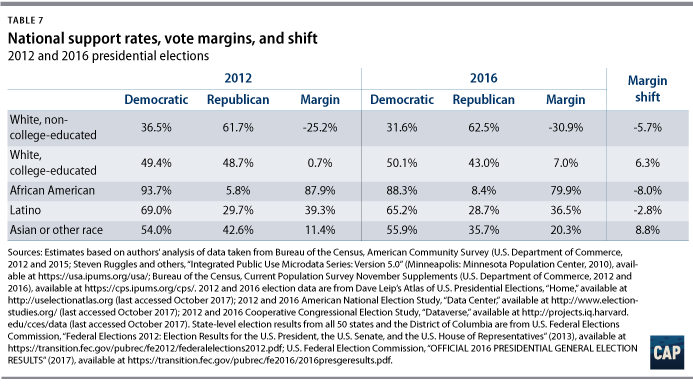
Reflecting the fairly large change among non-college-educated white voters, plus their very large size as a group, this was the support shift that had the largest effect on Clinton’s fortunes. If Clinton had been able to replicate Obama’s level of support among non-college-educated white voters, she would have carried the popular vote by 4.4 points instead of the 2.1-point advantage she had last November.
Interestingly, the second most important shift holding down Clinton’s support was the decline in vote margin among black voters. That shift took 0.9 points off of her popular vote margin, which is actually slightly more than she lost from the decline in black turnout. (see previous section)
A final note here: In the discussion above and subsequently in our discussion of particular states, we concentrate on margin shifts relative to 2012 because these directly determined the relative electoral fortunes of Trump and Clinton. However, in this election it was typically not the case that margin shifts for a given group relative to 2012 were composed of decreases in support for one major party and equivalent increases in support for the other major party. There were usually some increases in third-party voting as well.
For example, among white non-college-educated voters in 2016, there was a 5-point decrease in support for Clinton relative to Obama, a 1-point increase in support for Trump relative to Romney, and a 4-point increase in third-party voting. Among white college-educated voters there was a 6-point decrease in support for Trump relative to Romney, a 1-point increase in support for Clinton relative to Obama, and a 5-point increase in third-party voting. Finally, among black voters there was a 5-point decrease in support for Clinton, a 3-point increase in support for Trump, and a 3-point increase in third-party voting. Thus, even though the changes in margin between Democrats and Republicans determined the election outcomes, it should be kept in mind that increased third-party voting was frequently implicated in these margin changes.
The story in the states
Looking first at the three key Rust Belt states, Michigan’s white non-college-educated voters shifted strongly against Clinton, as suggested by the exit polls—from 44-54 percent in 2012 to 36-57 percent in 2016—although the magnitude of the shift is less than was reported by the exit polls.
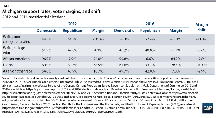
Our estimates also indicate that Obama actually carried white college-educated voters in Michigan 52-47 percent while Clinton lost them, albeit narrowly, 46-48 percent. As for black support, we found a fairly sharp fall from 97-3 percent in 2012 to 91-7 percent in 2016, a margin shift of 10 points against Clinton, significantly greater than the 4 points reported by the exit polls.
Of these changes, by far the most significant was the white non-college-educated shift. If Clinton had retained Obama’s 2012 white non-college-educated support, she would have won Michigan by almost 6 points, rather than losing it by the whisker she did. But it is also true that she would have won the state by a point or so if she had received as much support as Obama did from Michigan’s black voters—again, a greater advantage for Clinton than would have been afforded by consistent black turnout across the two elections.
In Pennsylvania, we found that the Democratic deficit among white non-college-educated voters increased from 39-59 percent in 2012 to 34-62 percent in 2016. This is a significant shift but far less than that claimed by the exit polls—from 43-56 percent to 32-64 percent—primarily because the exit polls claimed that Obama’s support among white non-college-educated voters was much larger than it probably was. We also found that Democrats carried white college-educated voters in both elections—55-43 percent in 2012 versus 52-42 percent in 2016—compared to the exit polls, which indicated a 15-point loss in 2012 and only a tie in 2016. And, similar to the Michigan results, we found a significant support shift among black voters, with the Democrats’ margin declining 10 points from 96-4 percent to 90-8 percent.
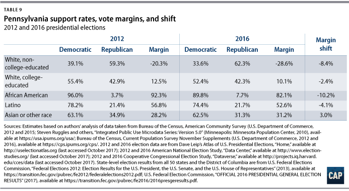
Here also the most important shift by far is the white non-college-educated shift. If Clinton had performed as well as Obama among this group, she would have carried the state by almost 4 points instead of losing it by 0.7 points. But she also would have emerged victorious—though just barely—if she had retained Obama’s black support.
Turning to Wisconsin, our data show Democrats’ white non-college-educated deficit ballooning from 47-52 percent in 2012 to 38-56 percent in 2016, a substantial 13-point margin shift against Clinton, but still much less than the 23 points suggested by the exit polls. As for white college-educated voters, we found again that both Obama and Clinton carried this group in the state—55-44 percent in 2012 and 55-39 percent in 2016—while the exit polls claimed that Obama lost white college-educated voters in 2012 and that Clinton only carried them by 10 points in 2016. Black voters in our data shifted 7 points against Clinton relative to 2012, compared to the mere 2 points indicated in the exit polls.
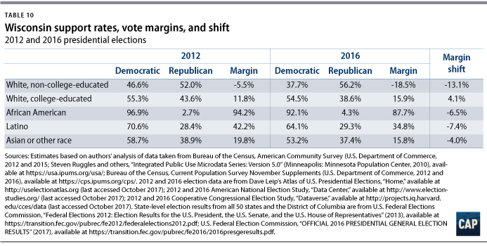
Once again, the large white non-college-educated support shift was key to Clinton’s fortunes in the state. If she had done as well as Obama among this group, she would have carried Wisconsin by a whopping 7 points, instead of being nosed out by Trump. The black support shift against Clinton, however, had relatively little effect; in this case, the decline in black turnout was much more important. (see previous section)
Across these three key states, we found large shifts against Clinton among white non-college-educated voters, although typically not as large as those indicated by the exit polls. These shifts had the largest effects on Clinton’s fortunes in these states; had they not occurred she would have carried all three states easily. We also found that Clinton did much better among white college-educated voters in these states than was suggested by the exit polls.
In terms of black support, we estimate that the shifts in black support against Clinton were greater in all three states than was shown by the exit polls. And in two of the three states—Michigan and Pennsylvania—these shifts in black support were more important to Clinton’s losses than the decline in black turnout.
Turning to Clinton’s other key, but not as close, losses—Florida, Iowa, and Ohio—in Florida, there was only a rather modest white non-college-educated shift against Clinton and a somewhat larger one in her favor among white college graduates. However, among both black and Latino voters there were significant shifts in support against Clinton—8 and 7 points, respectively. Interestingly, the shifts in white non-college-educated, black, and Latino support each disadvantaged Clinton by roughly the same amount—a little more than a point—and each of these shifts, had they not occurred, would have been close to enough to tip the state in her favor.
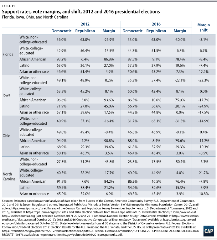
In Iowa, the big story by a very wide margin was the shift in the white non-college-educated vote. Our data show a massive 22-point shift against Clinton among this group, going from a tied vote in 2012 for Obama to a 35-57 percent deficit for Clinton in 2016. If this shift had not occurred, Clinton would have won the state by 5 points. Interestingly, our data also show the Democrats’ margin among white college grads holding steady across the two elections at roughly an 8-point advantage, quite different from the exit polls’ claim that Clinton lost this group by 6 points. In terms of voters of color, our data indicate very large shifts against Clinton among these voters, not far off the shift observed among white non-college-educated voters. However, these voter groups are so small in Iowa that these shifts had very little effect on the election outcome.
Ohio also experienced a very large shift of white non-college-educated voters against Clinton: from 41-57 percent in 2012 to 32-63 percent in 2016, a margin shift of 15 points. If that had not occurred the state would have been a toss-up instead of an 8-point victory for Trump. As in Iowa, the Democratic margin among Ohio’s white college graduates did not change across the two elections—tied 49-49 percent in 2012 and 47-47 percent in 2016—a far cry from the exit polls’ claim that Democrats lost this group by wide margins in both elections. The other support shift that had a significant effect on the outcome in the state was the decline in the Democratic margin among black voters, down 11 points from 95-4 percent in 2012 to 88-8 percent in 2016. That shift contributed a little more than a point to Clinton’s deficit, though here it is worth noting that a sharp decline in black turnout—see earlier section—actually had a greater effect on Clinton’s fortunes in the state.
North Carolina, a state where a narrow Republican advantage in 2012 became slightly larger, saw a fairly modest shift toward Republicans among white non-college-educated voters, although that increase was on top of an already massive deficit—from 27-71 percent in 2012 to 23-74 percent in 2016. That shift, by itself, would have made the state much closer had it not happened, but it would not have flipped the state to Clinton. As for white college graduates, our data indicate that there was a very large shift toward Clinton in the state, from a 41-58 percent deficit in 2012 to a 49-45 percent advantage in 2016—the exit polls, in contrast, showed a large Democratic deficit among this group in both elections. Among black voters, we again estimate a shift against Clinton, this time from 92-8 percent to 87-11 percent. That shift also contributed to Clinton’s slippage in the state, although, as in Ohio, the decline in black turnout had a larger effect on the election.
Turning to the three perhaps-swing-states-in-waiting where Clinton actually improved over Obama’s performance—Arizona, Georgia, and Texas—we found that in Arizona Clinton did better, unusually, among both white non-college-educated and college-educated voters. Among white non-college-educated voters the improvement was quite modest—cutting the Democrats’ deficit from 28 to 26 points. But among white college-educated voters, Clinton turned a 43-54 percent deficit from 2012 into a virtual tie, 46-47 percent, in 2016. This improvement by itself cut Clinton’s deficit by almost 4 points in the state. Clinton also benefitted modestly from an increased margin among Arizona’s Latinos—36 points versus 32 points in 2012. But that change only contributed about a point to Clinton’s improved performance in 2016.
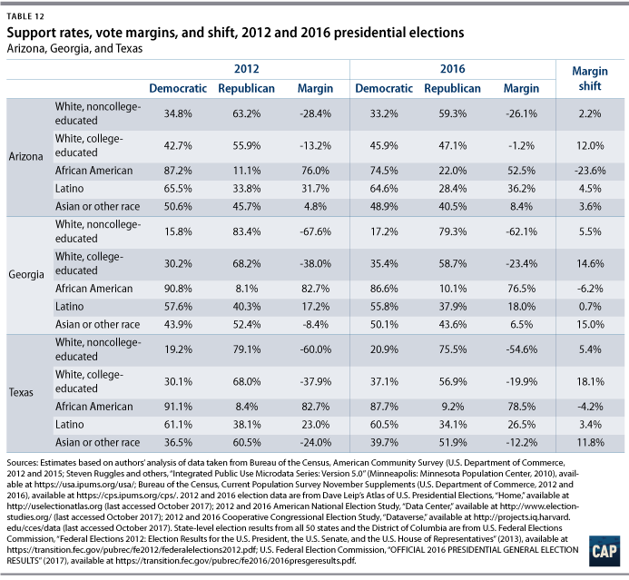
In Georgia, as in Arizona, our data indicate improvements for the Democrats among both white non-college-educated and white college-educated voters. And as in Arizona, the shift toward Clinton was much larger among white college graduates, cutting a 30-68 percent deficit in 2012 to 35-59 percent. That shift made the largest contribution—4 points versus 2 points from the white non-college-educated shift—to reducing the Republican victory margin in the state.
Finally, in Texas, we also found improvement for the Democrats among both white non-college-educated and college-educated voters. The Democrats’ deficit among Texas’s white non-college-educated voters fell from 60 points in 2012 to 55 points in 2016. But the shift toward Clinton among white college graduates in the state was much larger—from a 30-68 percent deficit in 2012 to 37-57 percent in 2016, a margin improvement of 18 points. The white college-educated improvement, again, was the big factor here, cutting Clinton’s deficit in the state by almost 5 points compared to a boost of less than 2 points from the white non-college-educated shift in her favor. There was also a modest improvement in the Democrats’ margin among Latino voters, increasing from 33 points in 2012 to 37 points in 2016. But that helped Clinton to the tune of only half a percentage point.
Simulations: What if 2016 had looked more like 2012?
While comments regarding the effect of various changes to the electorate have been peppered throughout this paper, this section is dedicated to dissecting these “what if” scenarios in greater length. However, before digging in it’s worth stepping back and clarifying the lessons that can be learned from these simulations as well as our intentions in performing them.
Since the election there has been a vigorous and, to our eyes, healthy debate regarding what happened in 2016. The barely concealed subtext of this conversation is an argument about what would have altered the results and how the parties should invest their time and resources in upcoming elections.
These simulations are not an endorsement of any given strategy nor should they be read as such. Running a simulation on the turnout or support rates of various demographic groups is much easier than actually changing Americans’ political behavior. It may very well be the case that simulations that produce the biggest Electoral College wins or the most secure state-level margins would have been the hardest to achieve. As such, the potential effects discussed here should be filtered through readers’ own sense of a given simulation’s feasibility.
That said, we had two goals when selecting our simulations. First, we wanted to speak as directly as possible to some of the major narratives that have developed since the election. Many people have strong beliefs regarding what would or would not have resulted in a different election outcome and we thought it necessary that these ideas be interrogated thoroughly. This goal accounts for our first two simulations.
Second, we wanted to explore simulations that told us something interesting about the electorate or more systematic changes that were occurring nationwide. This goal is responsible for our two remaining simulations.
Briefly, our four simulations answer the following questions:8
- What if black turnout and support had stayed at their 2012 levels?
- What if white non-college-educated support had stayed at its 2012 levels?
- What if Latino support had stayed at its 2012 levels?
- What if the eligible voter population had been the same as it was in 2012?
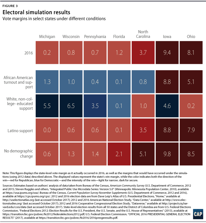
We’ll discuss the results of each simulation in detail below, but the topline results for several select states are displayed in Figure 3. Each square contains the new vote margin under the assumptions listed above. In short:
- Recreating 2012 black turnout and support levels would have produced a large but delicate Electoral College win for Clinton.
- Recreating 2012 white non-college-educated support levels would have produced a large and relatively secure Electoral College win for Clinton.
- Recreating 2012 Latino support levels would not have altered the outcome of the election or the outcome of any state.
- State-level demographic changes were not pivotal in 2016, but they did create conditions that were generally more favorable for Clinton.
Simulation 1: 2012 black turnout and support
Recreating 2012 Black turnout and support levels would have produced a large but delicate Electoral College win for Clinton. Dem: 323 / Rep: 215
Some of the biggest changes observed in 2016 were concentrated among African Americans. Nationwide black turnout dropped close to 4.5 points compared to 2012. This drop-off, combined with higher turnout rates among other racial groups, resulted in black voters shrinking as a percentage of actual voters—13 percent versus 11.9 percent—even as they grew slightly as a share of eligible voters.
In addition, the percentage of black voters who cast a ballot for Clinton in 2016 was about five and half points lower than the number who voted for Obama in 2012. Our results also suggest that Trump’s share was roughly 2.5 points higher than the one achieved by Romney.
Taking these two trends together, some have argued that Clinton could have avoided a loss if she were able to maintain prior levels of support and enthusiasm among black voters. Our results suggest that this is correct. More than that, this scenario produces the largest Electoral College win of any simulation presented in this report.
Several of the states that Obama won in 2012—Pennsylvania, Wisconsin, Michigan, and Florida—would have stayed Democratic under these conditions. While all of these states would have seen relatively narrow Democratic wins, Florida—a state that has been a consistent nail-biter on election night—would have gone to Clinton by just 0.05 points, or about 5,300 votes.
In addition, North Carolina, a state that Obama did not win in 2012, would also have gone Democratic due to a convergence of other trends. First, the share of eligible voters who were white and non-college-educated dropped by about 2.3 points between these two elections. The effect of this demographic shift was blunted by the rising turnout rates of these remaining eligible voters, but this still represents a big change in the state. Second, the voting behavior of white college-educated voters in North Carolina shifted radically between these two elections—a simultaneous shift away from the Republican Party and toward the Democratic Party resulted in a majority of these voters pulling the lever for Clinton. Taken together with a return to 2012 turnout and support levels among African Americans, these changes would have resulted in North Carolina’s 13 Electoral College votes going to Clinton.
Robustness of simulation
While this first simulation produces the largest Electoral College win out of all our simulations, this says nothing about the difficulty of achieving it. The 2008 and 2012 presidential elections were historic—representing the first serious candidacy mounted by a black candidate followed by the reelection of America’s first black president. In line with the historic nature of those elections, black turnout and support for Democrats were the highest ever seen in the modern political era.9 (see Figure 4)
It may very well be the case that recreating those levels of support and enthusiasm is unrealistic outside of that context. In fact, the overall levels of support and turnout among African Americans in 2016 bear a striking resemblance to 2004—the last pre-Obama election. Rather than signifying a dramatic loss for the Democratic Party, these changes may represent a return to customary voting behaviors.
Let us suppose for a moment that these difficulties are real. What if Democrats, even with a concerted effort, had only been able to split the difference between the 2012 and 2016 turnout rates and support rates of African Americans? This would not have resulted in a Democratic win; Clinton still would have lost Florida, North Carolina, and Pennsylvania.
Additionally, it’s worth appreciating the fact that this scenario is predicated on returning both turnout and support back to their 2012 levels. A return to just the turnout or support levels of 2012 would not have produced a win for Clinton in 2016. Recreating 2012 turnout levels would only have resulted in Democratic wins in Michigan and Wisconsin, while 2012 support levels would have netted just Michigan and Pennsylvania.
Simulation 2: 2012 white non-college-educated support
Recreating 2012 white non-college-educated support levels would have produced a large and relatively secure Electoral College win for Clinton. Dem: 314 / Rep: 224
Another important shift observed in 2016 was among white non-college-educated voters. While the media narrative that has emerged since November has characterized this change as “Trump making gains,” it would be more accurate to describe it as a shift away from Democrats. In aggregate, Clinton lost significant vote share among this group compared to Obama—36.5 percent versus 31.6 percent—but Trump only improved his margin slightly compared to Romney—61.7 percent versus 62.5 percent.
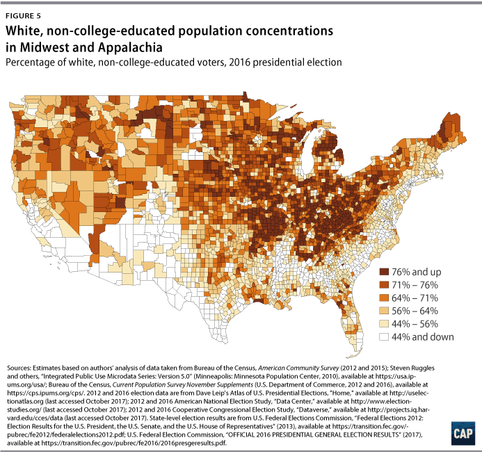
These vote shifts, combined with the strong clustering of white non-college-educated voters in the Midwest and Appalachia (see Figure 5), played a pivotal role in the 2016 election. In fact, the unanticipated losses suffered by Clinton in Pennsylvania, Michigan, and Wisconsin—the so-called “Blue Wall”—are largely explained by these two factors.
Taken together, some have argued that Clinton could have avoided a loss if she were able to maintain prior levels of support among white non-college-educated voters. Our results suggest that this is correct. It not only produces a large Electoral College win, but also one that is particularly robust.
Several of the states that Obama won in 2012—Pennsylvania, Wisconsin, Michigan, Iowa, and Florida—would have stayed Democratic under these conditions. In the first four of those states this simulation produces relatively robust wins, the narrowest of which is 3.5 percentage points in Pennsylvania. In contrast, Florida is once again an extremely narrow flip—a margin of about 5,200 votes making the difference between a Democratic and a Republican win.
Notably, this simulation does not produce a Democratic win in Ohio despite the fact that Obama won that state in 2012. Other changes in the state—particularly declining support and turnout rates among people of color—would have pushed Ohio out of Clinton’s grasp even if she had maintained Obama’s support levels among white non-college-educated voters.
Robustness of simulation
While this second simulation produces secure wins in several key states, this exercise says nothing about the difficulty of achieving it. To examine some of these potential difficulties, let’s take a look at white non-college-educated voters with a specific vote history: those supporting Obama in 2012 and then Trump or a third-party candidate in 2016. Although there is a multitude of ways to categorize these voters, let’s zero in on two subgroups that present significant hurdles to our simulation:10
- Former Democrats who didn’t support Clinton in 2016.
- Republicans who supported Obama in 2012.
The first group represents individuals who identified as Democrats in 2012 and voted for Obama in the last election, but changed their party affiliation and voted for Trump or a third-party candidate in 2016. While it’s easy to see these vote choices and reaffiliations as individual-level stories, the truth may be that they’re part of a larger, long-term exodus from the Democratic Party—one that started well before the 2016 election.
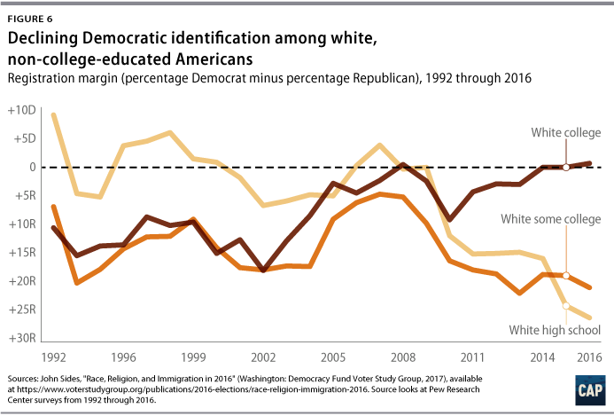
According to data from the Pew Research Center, there has been a sharp decline in the number of white voters without a college degree who identify as Democrats in the last 10 years. (see Figure 6) While whites with a high school education once identified with the Republican and Democratic parties at essentially equal rates in 2008, there was a 26-point advantage in Republican identification by 2016. The shift among white voters with some college was less dramatic—from a 4-point Republican advantage in 2008 to a 21-point advantage in 2016—but still represents a large change in such a short time period. In short, some portion of those who didn’t support Clinton but did support Obama were individuals who were already leaving the party before Clinton was even the nominee.
The second category is made up of individuals who have traditionally identified as or voted for Republicans but voted for Obama in 2012. While people have grown accustomed to thinking about those who voted for Obama in 2012 but not Clinton in 2016 as Democratic defectors, the reality is that some portion of these voters were really Republican defectors in 2012 and have now returned to their customary voting behavior. According to the VOTER survey, or Views of the Electorate Research Survey—a panel that tracked the party affiliations and vote choices of Americans between 2012 and 2016—about one in five of these white, non-college-educated voters we’re discussing identified as a Republican even as they were casting their ballots for Obama.11
Taken together, there is substantial reason to think that a good portion of these white non-college-educated voters were unlikely to vote Democratic in 2016. While additional resources aimed at reaching out might have resulted in smaller shifts, it seems unlikely that any discrete intervention in 2016 would have fully recreated the margins observed in 2012.
Let us assume for a moment that the difficulties described above are real. What if Democrats, even with a concerted effort, had only been able to split the difference between the 2012 and 2016 support rates of white non-college-educated voters? Under these conditions, Clinton still would have taken Michigan, Wisconsin, and Pennsylvania, and therefore won the election. The size of these wins is obviously smaller, but the narrowest is still a 1.4-point win in Pennsylvania.
Let’s take it one step further. What if maintaining 2012 levels of support was so difficult that Clinton’s best efforts would only have been marginally effective—closing the gap between the support levels observed in 2012 and 2016 by just a quarter? Our simulation predicts that Clinton still would have carried these three Rust Belt states, with Pennsylvania now going Democratic by a very narrow 0.3 points.
Simulation 3: 2012 Latino support
On its own, Latino support returning to its 2012 levels would not have altered the outcome of the election or the outcome of any state. The simulation clearly has the biggest effect in Florida, but results in no Electoral College change.
In many ways 2016 was about the U.S. electorate running away from the two major parties rather than running toward either one of them. No demographic exemplified that more than Latino voters. While every other group we’ve examined in this report has, in aggregate, moved strongly away from one major party and at least somewhat toward the other, Latinos moved away from both parties. According to our analysis, the percent voting Democratic declined 3.8 points between 2012 and 2016 while the percent voting Republican declined 1.0 points.
While no one has seriously argued that the 2016 election hinged on changes in Latino voting behavior, we found this simulation worthwhile to explore given the rising influence and unique electoral features of this group. As expected, our results suggest that a return to 2012 levels of support would not have resulted in a win for Clinton.
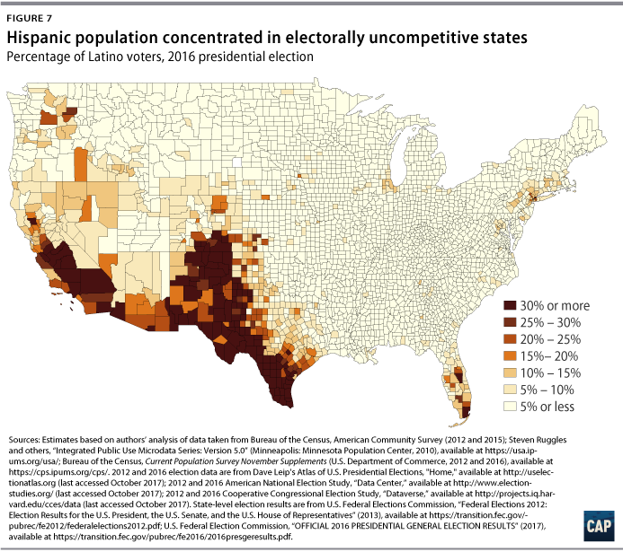
Geographically, Latinos can almost be considered an inverse image of white non-college-educated voters. While the latter had an outsized influence on the 2016 election because of their geographic distribution, the former punches below its weight. Latino voters tend to be concentrated in a relatively small number of counties in the country and those counties tend to be located in non-swing states. (see Figure 7)
The three states with the largest percentage of Latino voters—New Mexico, California, and Texas—were uncontested in 2016 and probably will be for at least several more presidential cycles. Of the next three—Arizona, Florida, and Nevada—only Florida is a true swing state, at least for now. That said, our simulation shows that even in this relatively high population state, Latino voters shifting back to their 2012 support levels would not have closed the gap for Clinton. It still would have missed the mark by about 5,000 votes.
Simulation 4: No demographic change
State-level demographic changes were not pivotal in 2016, but they did create conditions that were generally more favorable for Clinton. Absent any changes in the eligible voter population, several states that Trump won narrowly would have been much safer for him. The simulation results in no Electoral College change.
While the effects of demographics and demographic shifts are often overstated for any particular election, this doesn’t change the fact that they play an important role. Demographics may not be destiny, but in the short term it is reasonable to quantify the effects of demographic changes on election outcomes.
Our fourth simulation measures this very thing: What would the 2016 election look like if there had not been any demographic changes in the past four years? We held turnout and support rates constant, but fed them into the demographics that were observed back in 2012. The effect is nearly universal—the demographic changes observed since 2012 have created an electoral landscape that is slightly more favorable to Democrats. Had the population somehow remained unchanged during this time period, we expect Clinton would have won the national vote by 1.2 points rather than 2.1.
While these changes did not prove pivotal in any state, the estimated effect is still rather substantial. In our seven states of interest, this simulated population stability would have resulted in margins even more favorable for Trump. In Michigan, Wisconson, and Pennsylvania Trump could have achieved margins that were 0.4, 0.5, and 0.7 points more favorable than the ones observed in 2016—moving these states more safely into his win column. Although these states were not close, Ohio and Iowa would have seen a similarly sized 0.4 point shift. However, North Carolina and Florida, two states undergoing relatively rapid demographic shifts, were the most affected by changes to their eligible voter population. Absent these changes, Trump would have expanded his win by 0.9 and 1.4 points in these states, respectively.
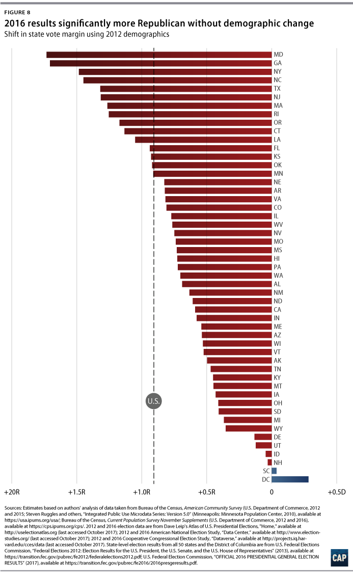
Broadening our horizons slightly, a number of states were significantly more Democratic in 2016 than they would have been given a stable population. (see Figure 8) Clinton’s margin was probably more than 1 percentage point higher in Louisiana, Connecticut, Oregon, Rhode Island, Massachusetts, New Jersey, Texas, and New York due the demographic shifts in the past 4 years. Georgia and Maryland were even more extreme, with margins around 1.5 points better for Clinton.
In fact, only two places were Republican-advantaged as a result of demographic changes since 2012: Washington, D.C., and South Carolina. Both have black populations that are shrinking as a share of eligible voters while less Democratic-leaning voters who are white and college-educated, Latino, and Asian or other race are growing. The demographic churn within these states creates a unique scenario: populations that are simultaneously becoming more racially diverse and less Democratic.
Conclusion: What next?
The findings from these data and simulations suggest that many of the existing intra-Democratic Party debates about the path forward have missed the mark. Rather than deciding whether to focus on (1) increasing turnout and mobilization of communities of color, a key component of the Democratic base, or (2) renewing efforts to persuade and win back some segment of white non-college-educated voters and to increase inroads among the white college-educated population, Democrats would clearly benefit from pursuing a political strategy capable of doing both.
Increasing the turnout of voters of color to Obama-level numbers, particularly among African Americans, would have turned the election narrowly in the Democrats’ favor. If black turnout and support rates in 2016 had matched 2012 levels, Democrats would have held Florida, Michigan, Pennsylvania, and Wisconsin and flipped North Carolina, for a 323 to 215 Electoral College victory. So increasing engagement, mobilization, and representation of people of color must remain an important and sustained goal of Democrats. They cannot expect to win and expand their representation in other offices without the full engagement and participation of voters who are black, Latino, and Asian American or other race.
At the same time, the Democrats would have made even larger gains in most states if they had successfully held President Obama’s 2012 margin among white voters without a college degree, regardless of turnout. Under this scenario, Democrats would have held Florida, Iowa, Michigan, Pennsylvania, and Wisconsin for a 314 to 224 Electoral College victory. Given the fact that the white non-college-educated voting population is almost four times larger as a share of the electorate than is the black voting population, it is critical for Democrats to attract more support from the white non-college-educated voting bloc—even just reducing the deficit to something more manageable, as Obama did in 2008 and 2012.
Finally, because Hillary Clinton actually improved upon Barack Obama’s 2012 vote margin among white voters with a college degree, carrying them by a solid margin, it behooves Democrats to continue reaching out to this large bloc of voters, many of whom did not vote for Donald Trump and many of whom do not like the direction of his current presidency. Likewise, the apparent shift to third-party voting and potential disengagement among younger voters must be considered carefully if Democrats are to make gains against Trump and Republicans in 2020.
Although the exact strategy for achieving this is beyond the confines of this paper, we have argued in the past that Democrats must go beyond the “identity politics” versus “economic populism” debate to create a genuine cross-racial, cross-class coalition that supports economic opportunity, good jobs, and decent social provisions for all people and makes specific steps to improve the conditions of people of color, many of whom continue to suffer from the legacy of historical and institutional racism in housing, schools, wealth building, and job access.12
President Trump and Republicans face some difficult choices in terms of next steps, given the short-term advantages of the president’s coalition of white conservative voters within the Electoral College system and the long-term disadvantages of the party in terms of shifting demographics, the president’s unpopularity, and the overall agenda of Republicans on taxes, health care, and other social policies. President Trump can conceivably reconstruct his primarily white coalition from 2016 with very few changes and still eke out a narrow Electoral College victory in 2020. But this assumes that Democrats do little to either increase the turnout of voters of color or to make inroads with disaffected white Trump voters, particularly Obama-Trump voters.
Alternatively, both Trump and Republicans could expand their electoral advantages among white voters by focusing and delivering on their economic promises on infrastructure, jobs, and wages and doing more to help people with health care. They could also make inroads with some voters of color by turning away from Trump’s racial appeals and offering more support for civil rights and the economic needs of these communities. Given the trajectory of the current administration, this seems unlikely and could actually lead to a schism and third-party split among Republicans.
Based on what we now know more clearly about the 2016 election and the shifting nature of much of the Trump administration’s actions and goals, the lead-up to the 2020 presidential election is likely to be fraught with multiple trial-and-error strategies by both parties and further splintered and unpredictable politics for the nation as a whole.
About the authors
Rob Griffin is the director of quantitative analysis at the Center for American Progress.
Ruy Teixeira and John Halpin are both senior fellows and co-directors of CAP’s Progressive Studies Program.
Acknowledgements
The authors would like to thank Lauren Vicary, Emily Haynes, Will Beaudouin, Steve Bonitatibus, and Chester Hawkins for their excellent editorial and graphic design work on this report.
Appendix
Turnout and support estimates
For this project we developed original turnout and support estimates by combining a multitude of publicly available data sources. We did this in order to deal with what we believe are systematic problems with some of the most widely available and widely cited pieces of data about elections.
One of the underappreciated problems in the world of election analysis is that some of the most reliable sources of data available on demographics, turnout, and support do not play very well together. For example, if we combine some of the best data we have on demographics with the best data we have on turnout, we find that they vary from the actual levels of turnout observed on Election Day.13 Furthermore, if we combine those data with the best data we have on vote choice we get election results that don’t line up with reality.14 This is not due to any one source of information being particularly biased; rather, each has points of weakness.
Our goal was to do better. To deal with these issues we had three guiding principles:
- Incorporate as much information from as many sources as possible.
- Lean on the strengths of individual data sources while accounting for their weaknesses.
- Make sure that our results matched up with election results from the real world.
For our analysis, we broke the U.S. population down into 32 demographic groups made up of four racial categories—white, black, Latino, and Asian or other race; four age groups—18–29, 30–44,45–64, and 65+; and two education groups—people with a four-year college degree and people without a four-year college degree. The product of this analysis is the following for each of those 32 groups:
- County-level estimates of eligible voter composition
- County-level turnout estimates
- County-level estimates of voter composition
- County-level party support estimates
These estimates are fully integrated with one another and, when combined, recreate the election results observed in 2012 and 2016. Below is a more detailed description of how each was created.
County-level eligible voter composition
We started off our process by collecting detailed demographic data at the county level from the U.S. Census Bureau’s American Communities Survey. The goal of this process was to produce reasonable estimates about the composition of eligible voters within a given county. Specifically, we wanted to know how many eligible voters in each county fell into each our 32 demographic groups.
Here we ran into our first problem: data this detailed aren’t available at the county level. For example, data on the race and age distribution as well as data on the age and education level distribution within a county are available separately. However, there aren’t data available on the race, age, and education level distribution.
To overcome this problem we employed a two-stage estimation process. First, we collected these disparate pieces of data on race, age, education level, and citizenship from the Census’s 2012 5-year and 2015 5-year American Communities Survey, or ACS. We then used iterative proportional fitting (IPF) to make these various pieces of data that are available line up with one another. IPF is a form of adjustment that allowed us to make individual group counts—for example, the number of eligible voters in a county who are black, 18–29 years old, and have a college degree—line up with known population margins—for example, the number of eligible voters who are black and have a college degree, the number of eligible voters who are age 18–29 and have a college degree, and the number of eligible voters who are black and age 18–29.
At this point in the process we had estimates on the eligible voter composition of each county, but there were several notable problems. First, the use of the 5-year ACS was necessary in order to get estimates for every county in the United States, but it provides a somewhat blurry image of the year in question. Data from the 2012 5-year ACS are an amalgamation of data from 2007–2012, while 2015 data are from 2011–2015. In short, the ACS provides the necessary coverage but at the expense of giving us an accurate picture of the population as it existed in the year in question.
Second, the IPF process tends to spread certain characteristics—say, citizenship—somewhat indiscriminately across groups so long as the totals line up with other margins. This is particularly problematic for something like education groups where—outside of the non-Hispanics white population—we see different rates of citizenship.
Third, the IPF process inevitably generates estimates that are logically consistent within a county given the margins that have been provided, but does not collectively add up to the number of people one can expect to belong to a given group in a state.
To address all three problems we included an additional corrective step. Using the individual-level data from the 2012 and 2015 1-year American Community Survey, we could accurately estimate the real state-level race, age, and education level composition of eligible voters. Logically, the numbers of eligible voters who fall into our 32 groups in the counties must add up to the number observed at the state level. We once again employed IPF to make the frequencies in the counties collectively line up with the frequencies at the state level. These were used as our final estimates for eligible voter composition in each state.
County-level turnout rates
The process of creating county-level 2012 and 2016 turnout rates for each of our 32 demographic groups began by generating state-level estimates for these groups. Using data from the 2012 and 2016 November Supplement of the Current Population Survey, or CPS, we ran cross-nested multilevel models that estimated the turnout rate for each year, state, race, age, and education level group represented in the data. Many of these groups can be very small, but this approach provides more realistic starting estimates of turnout for low-sample populations by partially pooling data across individuals’ geographic and demographic characteristics.
We then fed those state-level turnout estimates into the eligible voter counts we generated in the previous step. This provided us with an initial estimate of how many people turned out to vote in a particular county in each year. At this point the difficulties we previously described became apparent—the estimated number of voters from a given county will inevitably deviate from the real number who voted. Once again, we employed IPF at the county level to force these counts to match up with one another, increasing or decreasing the turnout rates for our 32 groups until the two aggregate vote counts aligned.
That said, it’s worth discussing how we use and think about these estimates. While we did generate county-level turnout rates that accurately recreate the aggregate turnout numbers observed in each county, there’s good reason to believe that they contain error. Instead of treating the numbers as completely accurate, we view this process as something that helps us generate more precise state-level estimates.
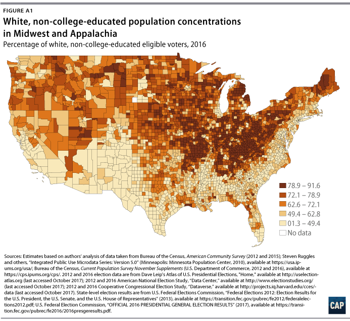
Namely, this process takes advantage of geographic segregation at the county level to selectively adjust turnout rates between demographic groups rather than applying a blanket correction at the state level. Looking at Figure A1—which shows the share of eligible voters in each county who are white and do not have a college degree—we can see that there are some places where more than 80 percent of the population falls into that demographic category. To the extent that our 32 demographic groups are non-randomly distributed across a state, this process will selectively push and pull their turnout rates. While the estimates within any given place may be off, we believe this discriminatory adjustment provides a better state-level picture.
County-level voter composition
Combining our eligible voter estimates with our turnout rates, we could generate counts for the number of individuals in each county who voted and belonged to one of our 32 demographic groups. The state-level compositions we reported throughout the paper are simply aggregations of these county counts.
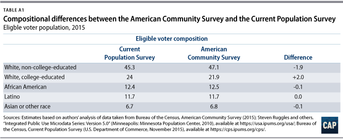
We feel that these estimates are superior to the ones typically reported from the November Supplement of the Current Population Survey for two reasons. First, the multilevel modeling previously mentioned helps produce better estimates for small populations across the country. Second, when compared to the ACS the CPS would appear to systematically underrepresent the number of eligible voters in the population who are white and do not have a college degree. As can be seen in Table A1—which compares the composition estimates from the 2015 CPS November Supplement and the 2015 1-year ACS—white non-college-educated citizens age 18 or older are underrepresented by 1.9 points while their white, college-educated counterparts are overrepresented by 2.0 points.
Given the superior sample size of the ACS, we believe it provides a more accurate picture of the eligible voter population, particularly at the state level. Assuming it is more accurate, post-stratifying our turnout estimates from the CPS onto the ACS eligible voter counts should provide a more accurate picture of the electorate.
County-level party support estimates
The process of creating county-level 2012 and 2016 Democratic and Republican support rates for each of our 32 demographic groups began by generating state-level estimates for these groups. Using publicly available data from the American National Election Study and the Cooperative Congressional Election Study in 2012 and 2016, as well as one of the post-election surveys from 2016 by Center for American Progress, we ran cross-nested multilevel models that estimate the turnout rate for each year, state, race, age, and education group represented in the data. Many of these groups can be very small, but this approach provides more realistic starting estimates of turnout for low-sample populations by partially pooling data across individuals’ geographic and demographic characteristics.
We then fed those state-level support estimates into the voter counts we generated in the previous step. This provided us with an initial estimate of how many people voted Democratic, Republican, and third party in a particular county in each year. Once again, the difficulties we described became apparent—the estimated number of Democratic, Republican, and third-party votes from a given county will inevitably deviate from the real election results. We employed IPF at the county level to force these counts to match up with one another, increasing or decreasing the support rates for our 32 groups until the aggregate vote counts aligned.
That said, it’s worth discussing how we use and think about these estimates. While we did generate county-level support rates that accurately recreate the aggregate election results observed in each county, there’s good reason to believe that they contain error. Instead of treating the numbers as completely accurate, we view this process as something that helps us generate more precise state-level estimates than previous methodologies.
We see the strengths and weaknesses of this process in the same light as we previously described in the turnout explanation above. Geographic segregation at the county level lets us selectively push and pull the support rates of our groups around rather than applying a blanket correction at a higher geographic level. The estimates within any given place may be off, but we believe this discriminatory adjustment provides a better state-level picture.
Simulation Estimates
Simulation 1
For this simulation we used the 2016 eligible voter composition within each county, but substituted the 2016 black turnout rates and party support rates with their 2012 counterparts. All other racial and educational groups were assigned their original 2016 turnout and support levels. Vote counts were then aggregated to the state level and reported.
Simulation 2
For this simulation we used the 2016 eligible voter composition within each county, but substituted the 2016 white, non-college-educated party support rates with their 2012 counterparts. All other racial and educational groups were assigned their original 2016 turnout and support levels. Vote counts were then aggregated to the state level and reported.
Simulation 3
For this simulation we used the 2016 eligible voter composition within each county, but substituted the 2016 Latino party support rates with their 2012 counterparts. All other racial and educational groups were assigned their original 2016 turnout and support levels. Vote counts were then aggregated to the state level and reported.
Simulation 4
For this simulation we used the 2016 turnout rates and party support rates for every racial and educational group, but substituted the 2016 eligible voter composition in each county with its 2012 counterpart. Vote counts were then aggregated to the state level and reported.